I’d like to humbly share that after working with many concepts and designers, the final logo was designed with love, by me. Design should tell a story, and sometimes the best person to tell a story is the one who has been watching it unfold for a lifetime.
The new Chanco Beauty logo is inspired by the traditional infinity symbol, but with a few twists and curls. Conventionally, the infinity sign symbolizes limitlessness and eternity. An ongoing cycle, one that never really has a clear start or end. This spoke to me deeply.
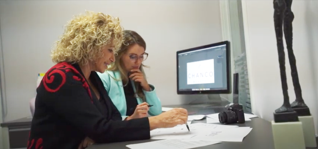
Watching my mother work her business for 30 years, through every up and down, will always be a source of inspiration for me. She is so incredibly dedicated to her work, and she still goes around the clock like she did when she was my age. Life changes, she changes, but she just never quits. Her enthusiasm goes on, and so this is a nod to her.
But I knew I couldn’t just leave it simple, because her story is anything but that. Which is why, if you’ll look closely, the infinity symbol is actually also the letters “C” and “P”.
That was us. Me and my mama. Pat & Chandler.
The start of our new journey together, not just as mother and daughter, or as best friends, but as business partners. The unexpected part of our relationship we didn’t know we were headed towards together, but felt like it was waiting for us from the start.
You’ll also notice that the “C” is slightly smaller than the “P”. This is a nod to the endless respect I have for my mother. She is the force of this company. The visionary behind it all. And she has been passing down a piece of that passion and that drive to me, in an endless and ongoing cycle all my life, whether I realized it or not.
Lastly, you’ll notice our new logo is slightly “curly.” I have learned to spot my mother in a crowd by one of my favorite things about her - her big curls. Over the years, she has become recognized in the PMU industry by her luscious natural curls, that are as wild and welcoming as she is.
The relationship I share with my mother has taught me the meaning of true beauty. This is something we are hoping to share in our industry. We want to carry quality products, that promote the values of the modern woman. A woman who is empowered, one who is not afraid to speak, and one who is not threatened by the success of others. She embraces her friends, supports them wholeheartedly and celebrates womanhood. From me and my mama, thank you for sharing this with us.
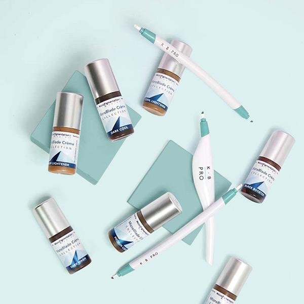
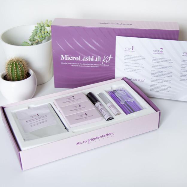
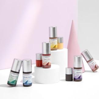 YOU CAN EXPLORE MORE PRODUCTS UNDER OUR PERMANENT MAKEUP SHOP!
 BROWSE 14+ MORE COURSES AVAILABLE IN PERMANENT MAKEUP AND MICROBLADING